Brand accessibility initiative
 Hone
Est. 4 minute read
Hone
Est. 4 minute read
The problem
In March 2023, Hone received a Support ticket asking if we made closed-captioning available in our live Zoom trainings. We were able to update our processes to make that feature available to learners in all Hone classes quite easily. However, it prompted me to investigate to what extent our product (and not just our third-party tools like Zoom) met accessibility standards.
At the time, Hone focused accessibility and inclusivity efforts primarily toward our content, not our product. This posed a risk to legal compliance, brand trust, and most importantly Hone's usability and inclusive product experience. As we focused on expanding our learner-facing product (by far our largest user base) and looked to move upmarket, I anticipated that current customers and prospects would look for WCAG compliance more and more often.
The research
I looked into WCAG standards, taking note of the standards that were particularly relevant to Hone's product (e.g. focus order) and the ones that we were less likely to need to address (e.g. video and audio playback).
I then conducted an audit to identify which accessibility violations occurred most frequently on our platform. The winner (or loser, depending on your point of view) was clear: we were in flagrant violation of color contrast standards, most egregiously through our use of our primary brand color within our platform.
The solution
Not only was our product palette and color contrast our most frequent violation, resolving it would also (a) take the least amount time, (b) involve the least engineering effort, and (c) was most in my control, so it made sense to solve this issue first.
An aggressive and feature-heavy product roadmap and a small engineering team meant that my support on this project would be limited. However, I knew that one of our engineers already had frustrations about a lack of intentional, well-established color variables that engineers could leverage quickly and easily. I sensed an opportunity to couple that work with my accessibility initiative and so gained another advocate and partner who was excited about making these changes.
The scope
After investigating alternative approaches, including using a darker secondary brand color within our platform, I got alignment from Product, Marketing, and our CEO on the following scope of work:
- Audit existing color usage on the platform and opportunities for color consolidation.
- Collaborating with our brand designer to create a new brand color and product palette, including neutrals and secondary/supporting colors, that give us more compliant color options.
- Work with our engineer to apply new color variables to our platform to resolve accessibility violations.
Additional work resulting from my initial audit would be added to our UX backlog, not tackled as part of this set of work.
The process
Audit & education
My first step here was to audit all the hex codes and color variables in our codebase (total jumpscare), with the goal of understanding which colors were used most often and in what contexts.
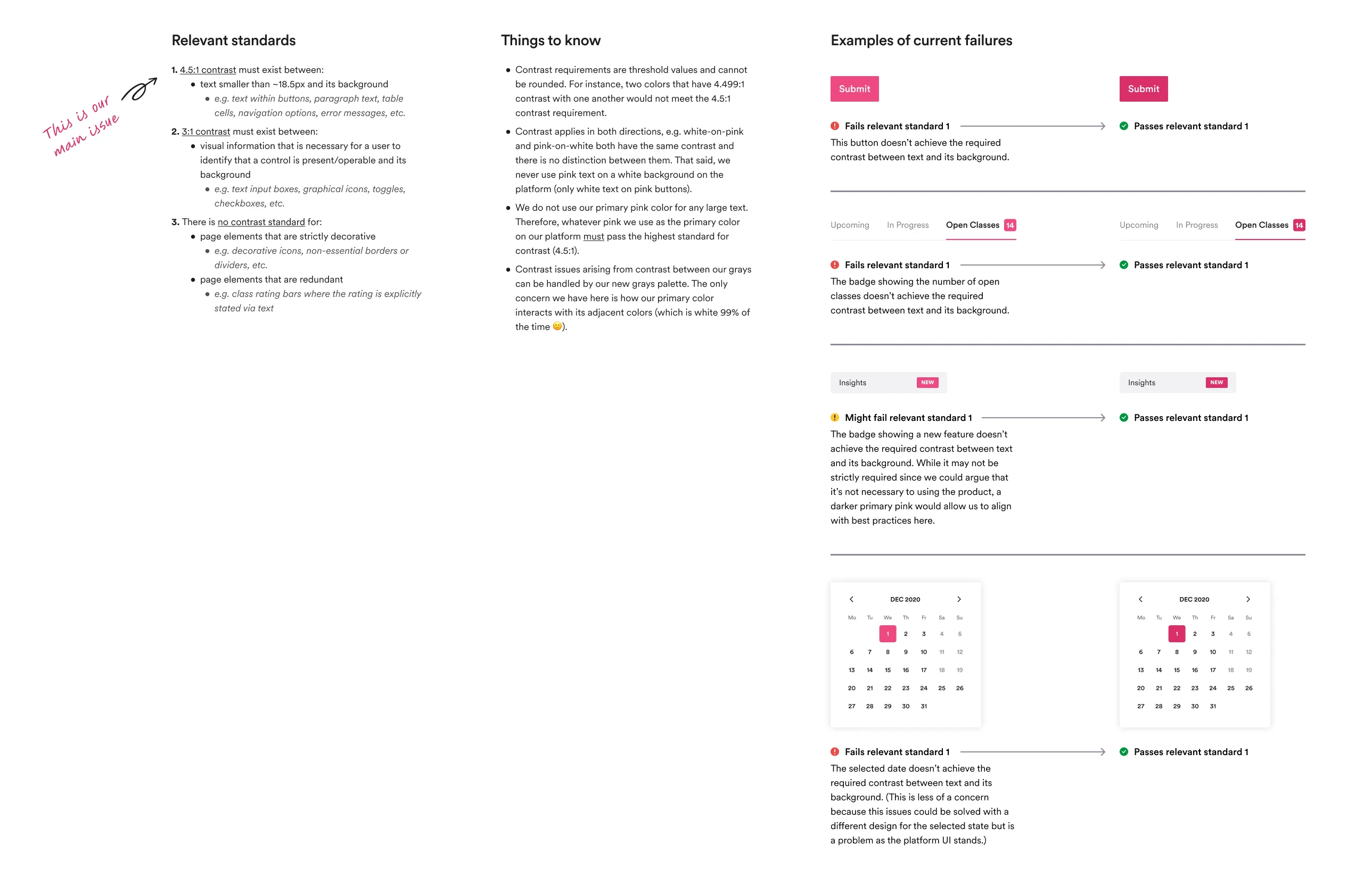
I then brought our brand designer up to speed on WCAG standards. I presented the standards most relevant to our product, as well as concrete examples from our UI where our new brand color would need to meet those standards.
Redesign
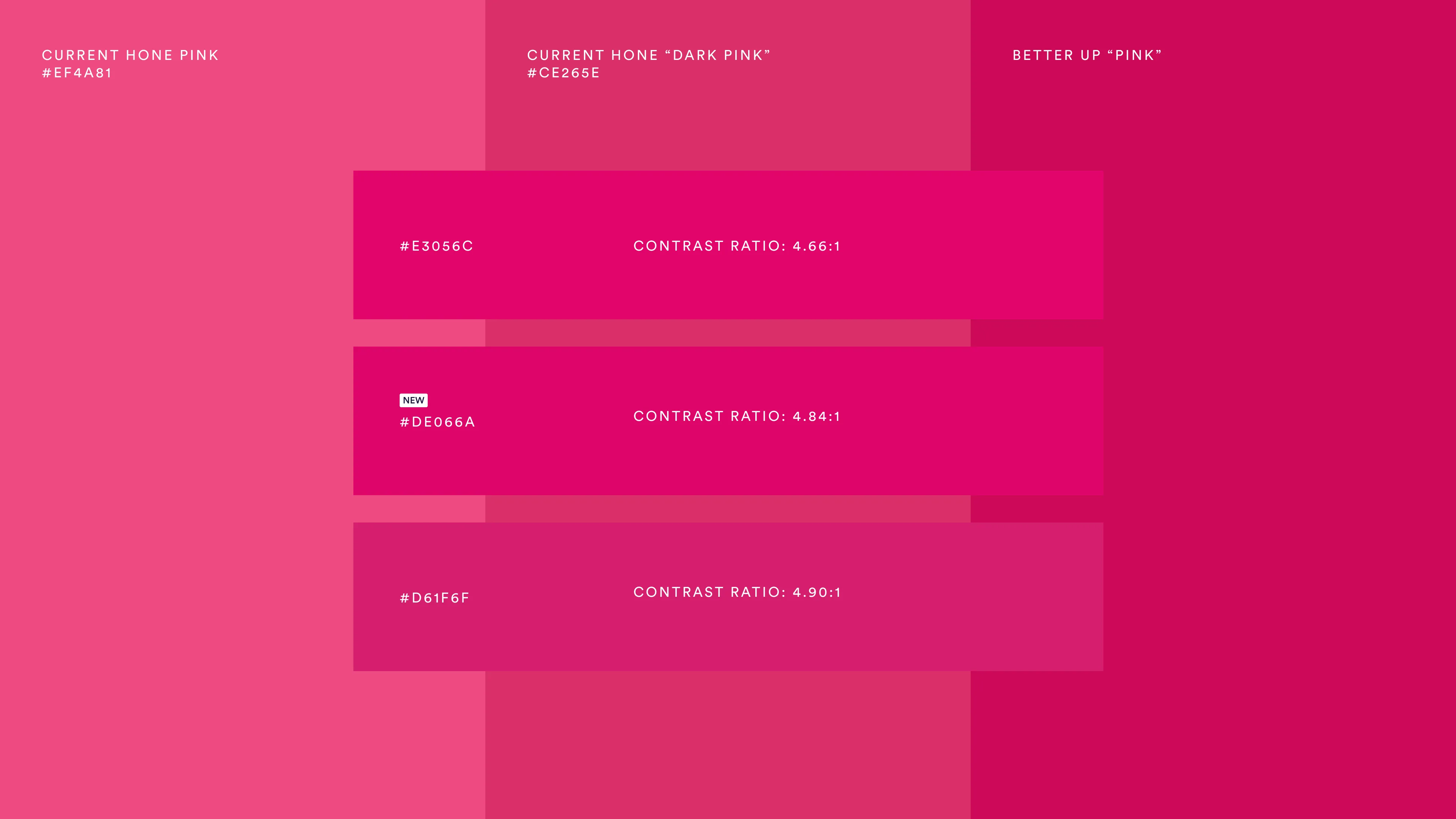
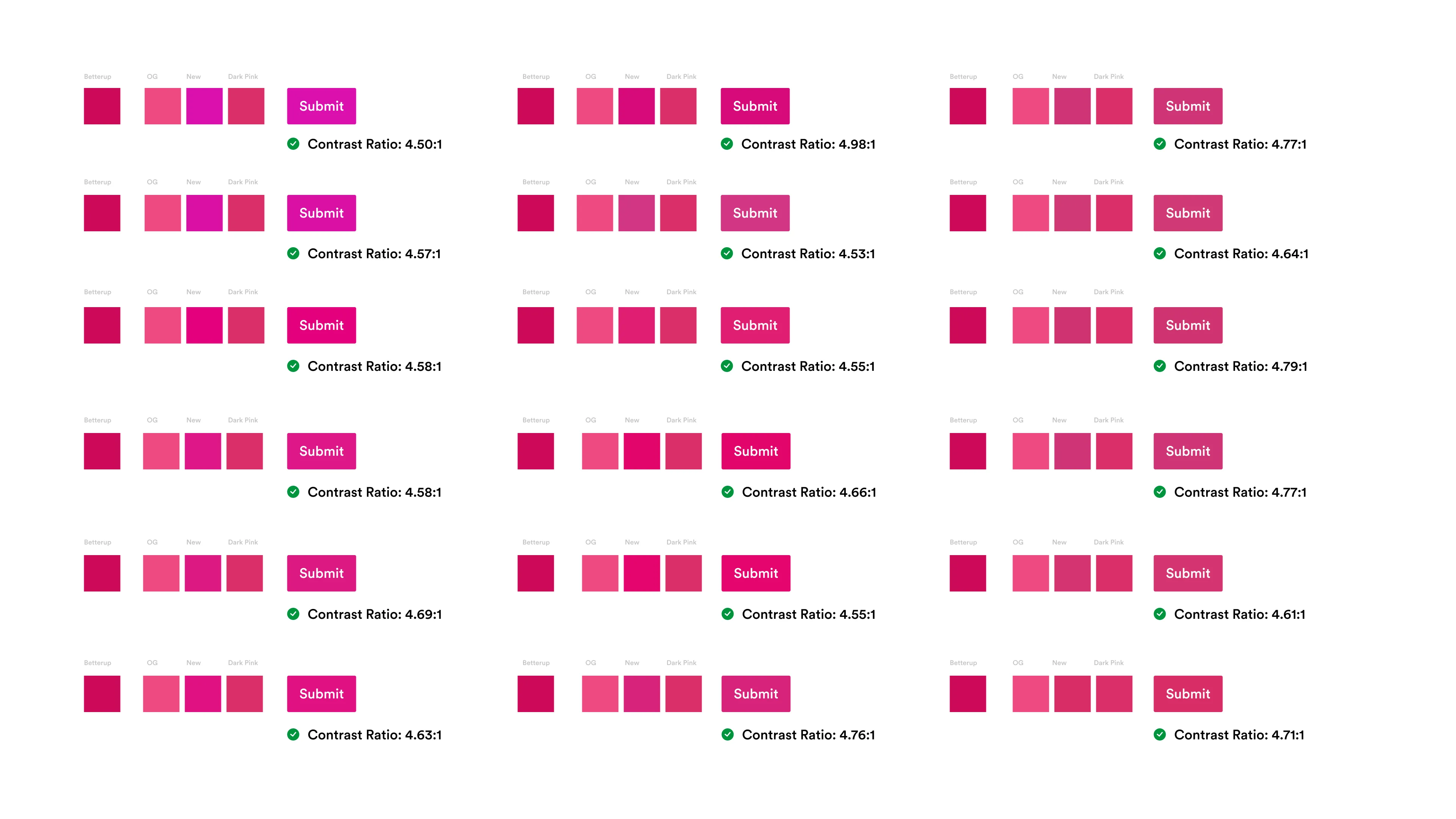
Our brand designer explored dozens of color variants to find one that preserved brand recognition while hitting a minimum 4.5:1 contrast ratio against white backgrounds and text. In parallel, I created a system of action colors (warning, error, success) and a neutral grayscale palette that would complement our brand colors.
Testing
Although this work was not tested in a traditional way, I stress-tested the new brand color by designing future scenarios and components where it would need to perform. That process surfaced an edge case where it would have failed WCAG standards — something that hadn't come up during the brand team's exploration. I proposed a variation that resolved the issue and gave us more flexibility for future design work. That variation is the color that shipped.
Implementation
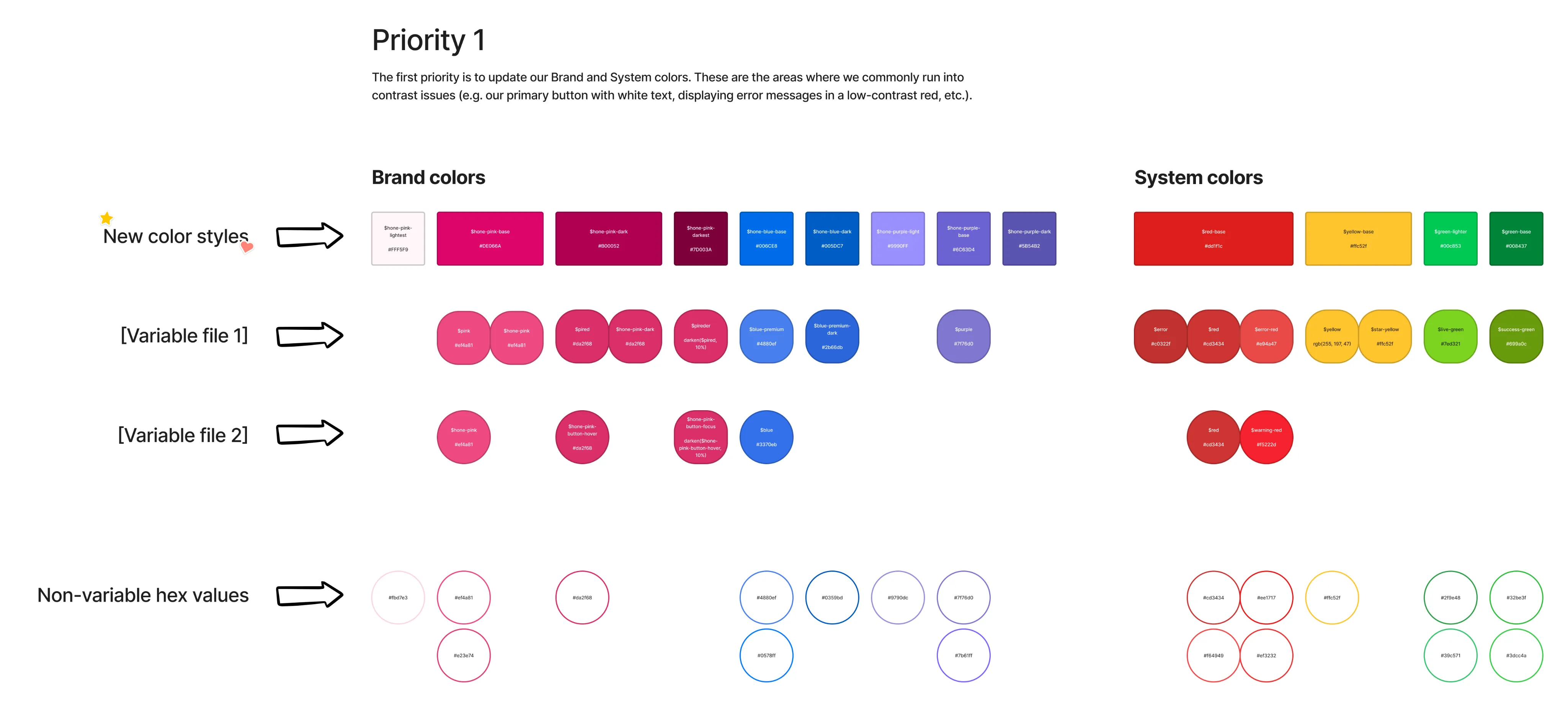
To prepare for implementation, I created a schema to show how colors currently used in our platform would align with our new palettes.
Since our engineer was working on this initiative alongside other feature work, I prioritized these changes in a phased approach to reduce her time spent per week. This ensured that we could make an impact right away while having a minimal effect on the rest of the product roadmap.
The aftermath
The color system that went into production reduced more than 30 ad hoc color variables down to 6 core colors with a consistent set of tints, shades, and a neutral palette. Loose hex codes in the codebase dropped by 99%+. Every page of the app was touched.
The most lasting effect of this project has been on how I approach accessibility in my own design practice. As we've continued to expand the product, I now think more broadly about how design decisions affect people with accessibility needs from the start.
If I were starting this project today, I would give more consideration to semantic color variables. It would have required more time, but it would have supported accessible interfaces more directly and given engineers more agency in making design decisions independently.